
Social Emotional Tech Lab · Apr – Dec 2023
Anywear Academy
Transforming research into a STEM program for empowering young girls
- In short
- Rebranded and restructured a research lab’s website, turning five years of research into a public STEM curriculum.
- My role
- Sole designer
- Timeline
- 7 months
- Focus
- Web, Brand identity, Info architecture
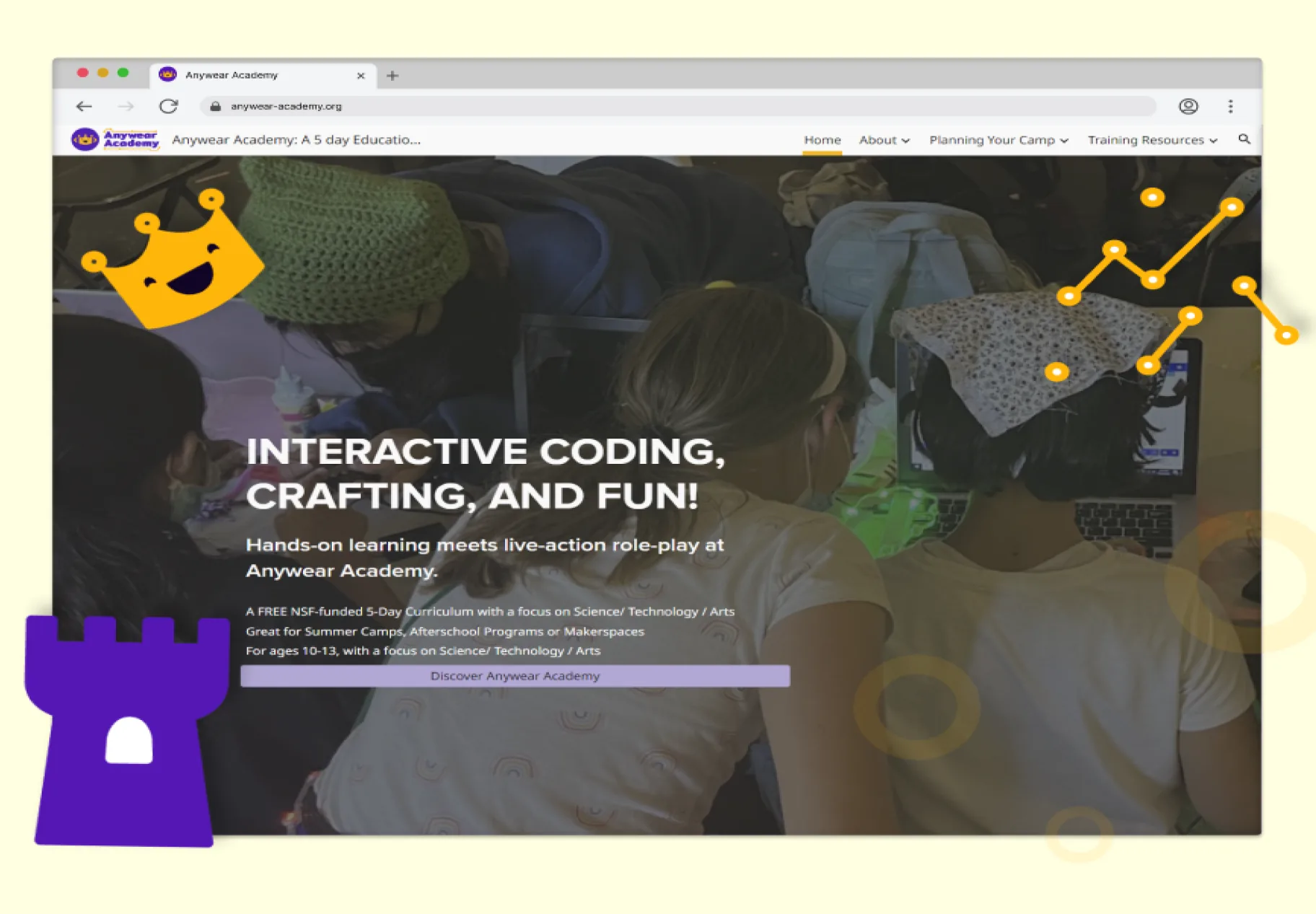
I worked with the UCSC Social Emotional Tech (SET) Lab to create a website and brand identity for a research project they were taking public. As the sole designer over 7 months, I was responsible for everything from research through design and implementation.
Challenge
The challenge
Five years of research that helped girls see themselves as coders, ready to go public.
I was brought into the SET Research Lab to create a website for their research project. For 5 years, grad students had been experimenting with edu-larping (educational role-play). They created a 5-day experience called Anywear Academy: a camp that blended coding, crafting, and team building through an interactive story where kids pretended to be agents on a mission to help the inhabitants of the planets they visited.
The researchers found that taking part in the camp increased young girls’ confidence in STEM and helped them see themselves as makers and coders.
The lab wanted to share their method as a curriculum, to inspire educators worldwide to run their own versions and empower more girls in STEM. They had a first draft of a website that contained only the content they wanted on it.
Problem
Understanding the problem
It read like a research paper, not a toolkit teachers could pick up.
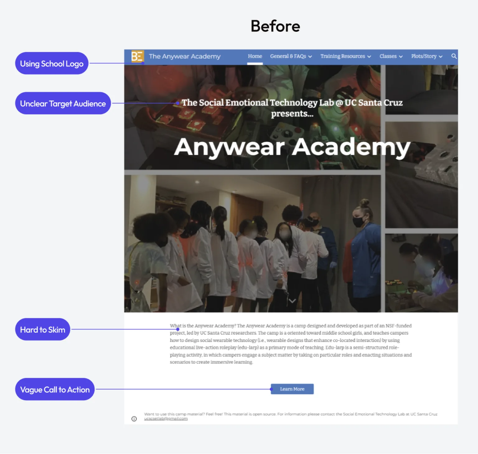
I started by testing the existing website with a summer theatre instructor, a sample of our target audience. Three big problems emerged:
- It felt like a research project, not a toolkit. The only hint that others could use it was tiny footer text: “Want to use this camp material? Feel free!”
- It looked too academic. UCSC branding and School of Engineering logos made it feel like a university extension, not something for the public.
- The audience was unclear. Teachers? Researchers? Summer camps? The confusion made navigation impossible: lots of small text, big paragraphs, few headings, and confusing pictures.
The mission I walked away with
- Repackage 5 years of research into an easy-to-digest DIY product that makes teachers curious and excited to try it themselves.
Research
Research
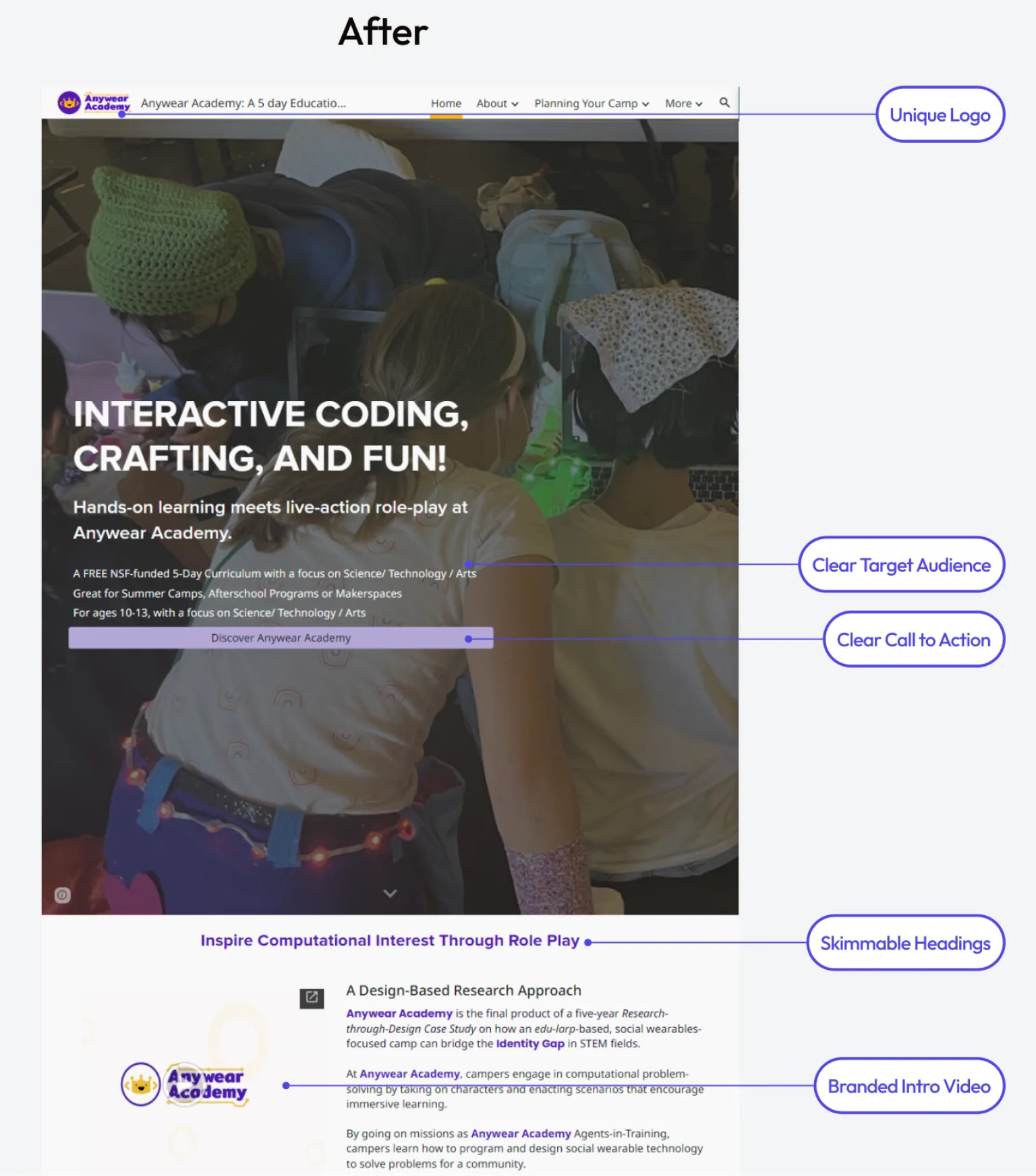
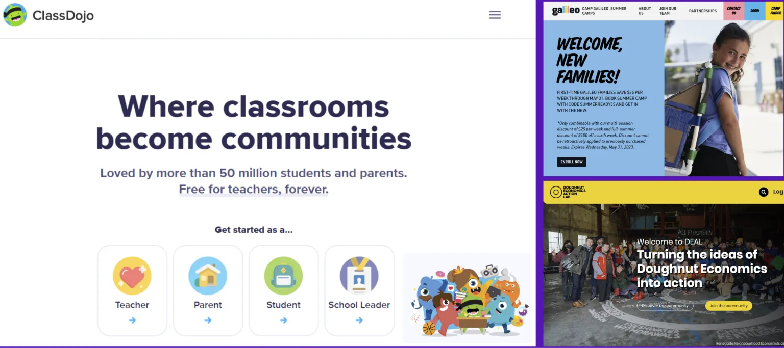
Friendly mascots and real photos make learning look fun.
I did a competitive analysis of educational platforms and found two key patterns: friendly mascots and authentic photography.
Colorful, smiling mascots and engaging photography became my two focus areas for changing the perception from “research project” to “fun DIY curriculum.”
Branding
Brainstorming with outsiders
Fresh eyes first, then AI to explore directions fast.
I ran 3 structured brainstorming sessions with lab interns who were unfamiliar with Anywear Academy, to capture an outsider’s perspective. We moved through three phases: word association to capture the program’s essence, visual mood boarding to expand our understanding, and symbolic exploration to find abstract concepts that could become logo imagery.
Using our refined brand principles, I put targeted keywords into AI logo generators to explore visual directions quickly. The results kept returning to fantasy symbols (crowns, castles) and adventure imagery (shields, swords), which matched our “magical adventure” and “fantasy” principles.
Iterating on the logo
Each round of feedback sharpened what the brand had to say.
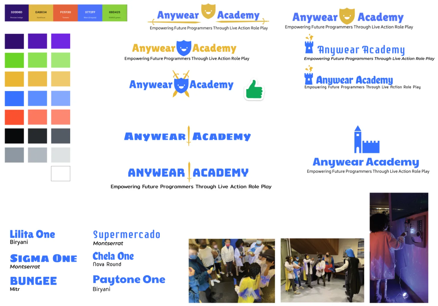
I took the strongest concepts from the AI exploration and recreated them as custom vector graphics.
My first attempt was a sword and shield. The researchers felt it was too masculine, so I went back to the drawing board. My second attempt, a smiling crown in purple and gold, captured the fantasy role-play and empowerment themes, but the researchers felt it was missing the STEM and coding element.
Authentic photography
Showing kids’ real, happy faces changed how the camp felt.
The original website blurred children’s faces for privacy, which made the camp look secretive instead of joyful. I convinced the lead researcher to get signed photo waivers from past camp participants. Authentic photos of happy kids transformed how people saw the program.
A palette from a camper’s creation
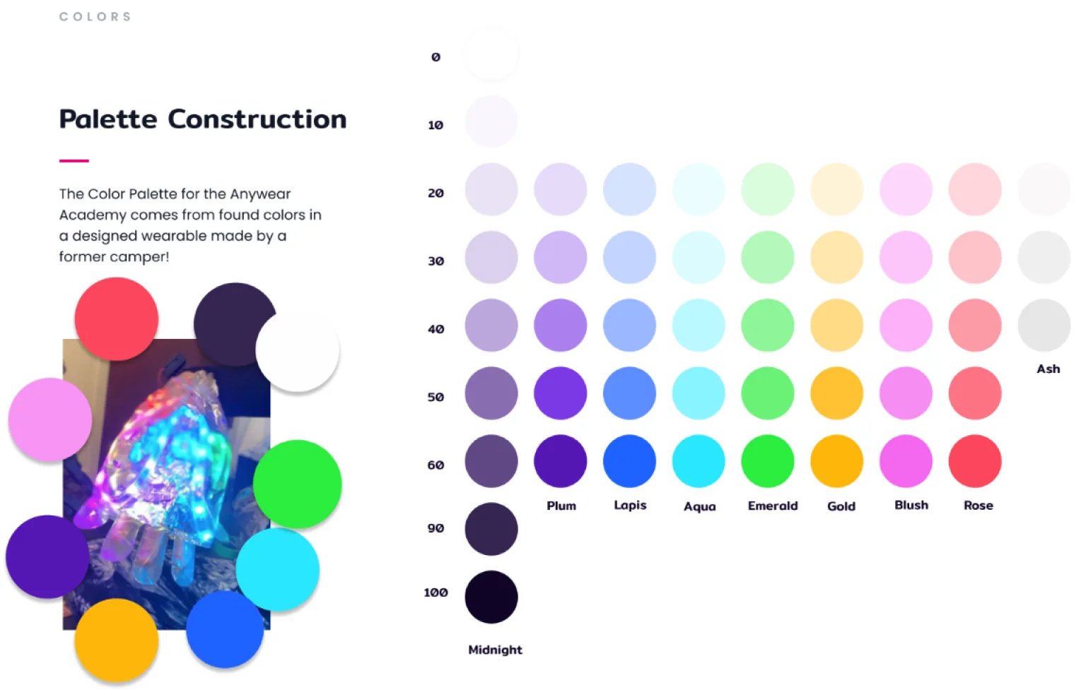
The brand colors come straight from something a camper made.
Rather than using a generic color scheme, I took the brand palette directly from a wearable device made by a former camper and featured in the lab’s research. That gave the brand colors a real connection to the program’s impact and to the students’ creativity.
After refining with two brand designers, I built out a complete brand kit with crown illustrations (based on the research team) and patterns that bring in coding and STEM elements. The brand kit was used in the main promotional video on the home page, showing how the design system extended beyond static assets to tie everything together.
Final design
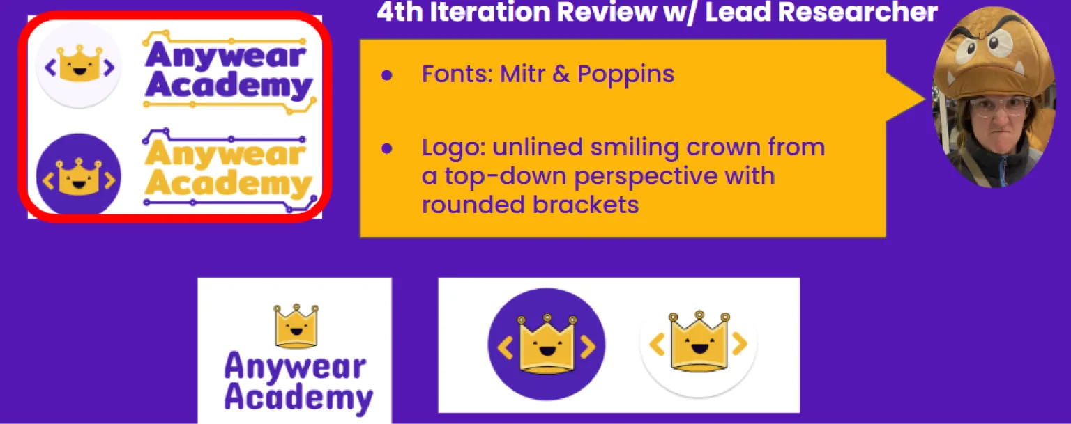
Three rounds of review, two finalists, one bold crown.
After three rounds of review, I narrowed it down to two logo designs. The final decision was up to the lead researcher, who chose the unlined crown with the big, bold font and the dot-and-line pattern.
Info Architecture
Information architecture overhaul
From one long page to four sections educators can navigate.
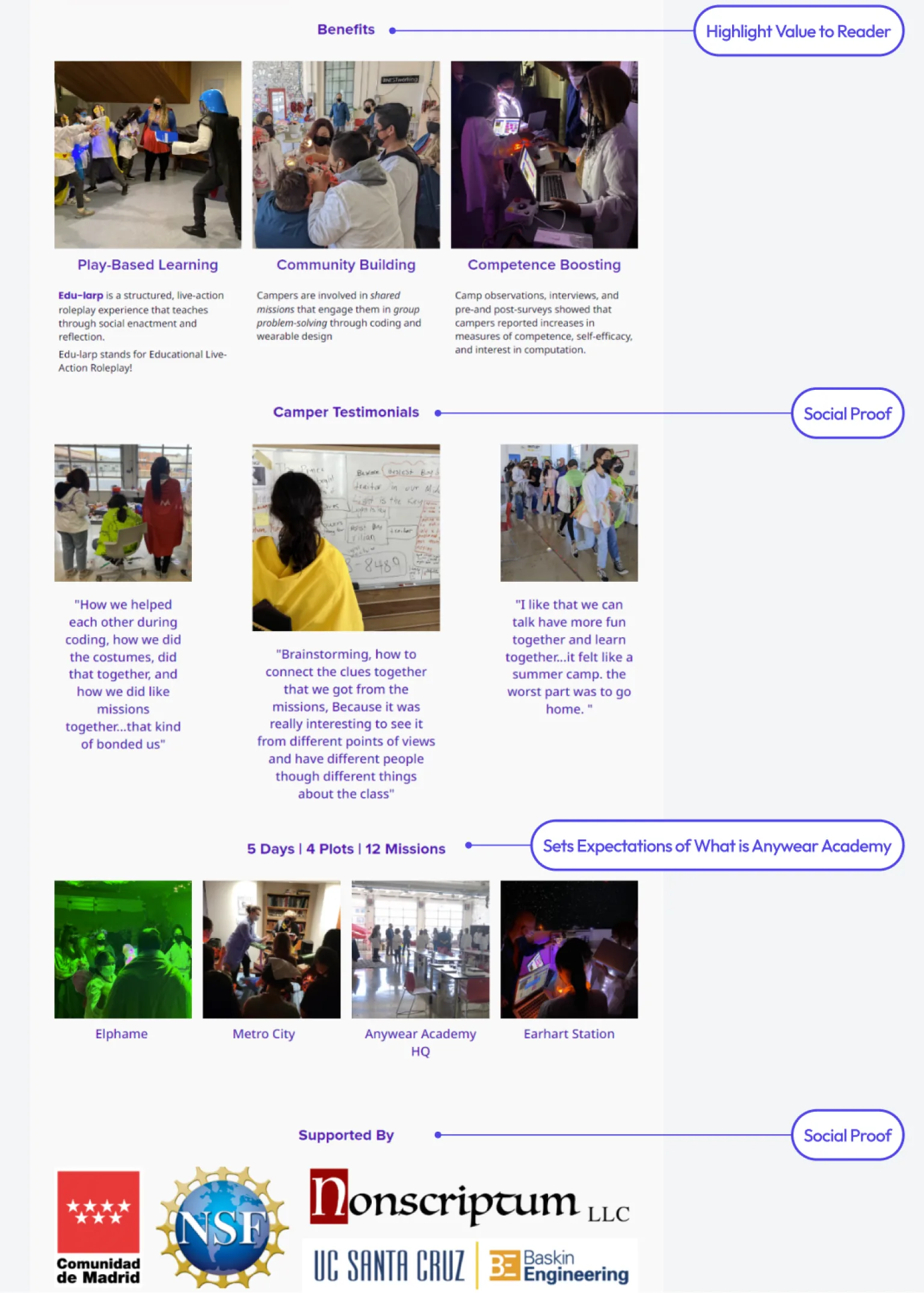
The original Google Site put all its content on one page with no clear hierarchy. After auditing the content with educators, I reorganized it into four main sections:
- Home: a quick overview for educators evaluating the program.
- About: the research background that inspired the program.
- Planning Your Camp: a how-to guide with curriculum and materials.
- Training Resources: facilitator support and resources.
Why this structure
- It lets educators quickly assess the program, then dive deeper into the implementation details.
Results
Results
Launched January 2024, opening the curriculum to educators worldwide.
The website launched in January 2024 and made the curriculum accessible to educators worldwide for the first time.
Multiple educators reviewed the final site and confirmed it successfully translated complex research into actionable curriculum materials.
The rebrand shifted the perception from “university research project” to “empowering DIY curriculum,” with the crown symbol and authentic photography conveying the program’s joyful, adventure-based approach.
Most importantly, the new structure let the lab share 5 years of proven educational research with the broader teaching community.