



Brandcave · Feb 2024 – Apr 2025
Cratejoy
Reducing decision fatigue in subscription box discovery through intuitive browsing
- In short
- Designed reusable product card, trust signal and content components for a better shopping experience.
- My role
- One of three designers
- Timeline
- 3 months
- Focus
- E-commerce, UX, Design systems
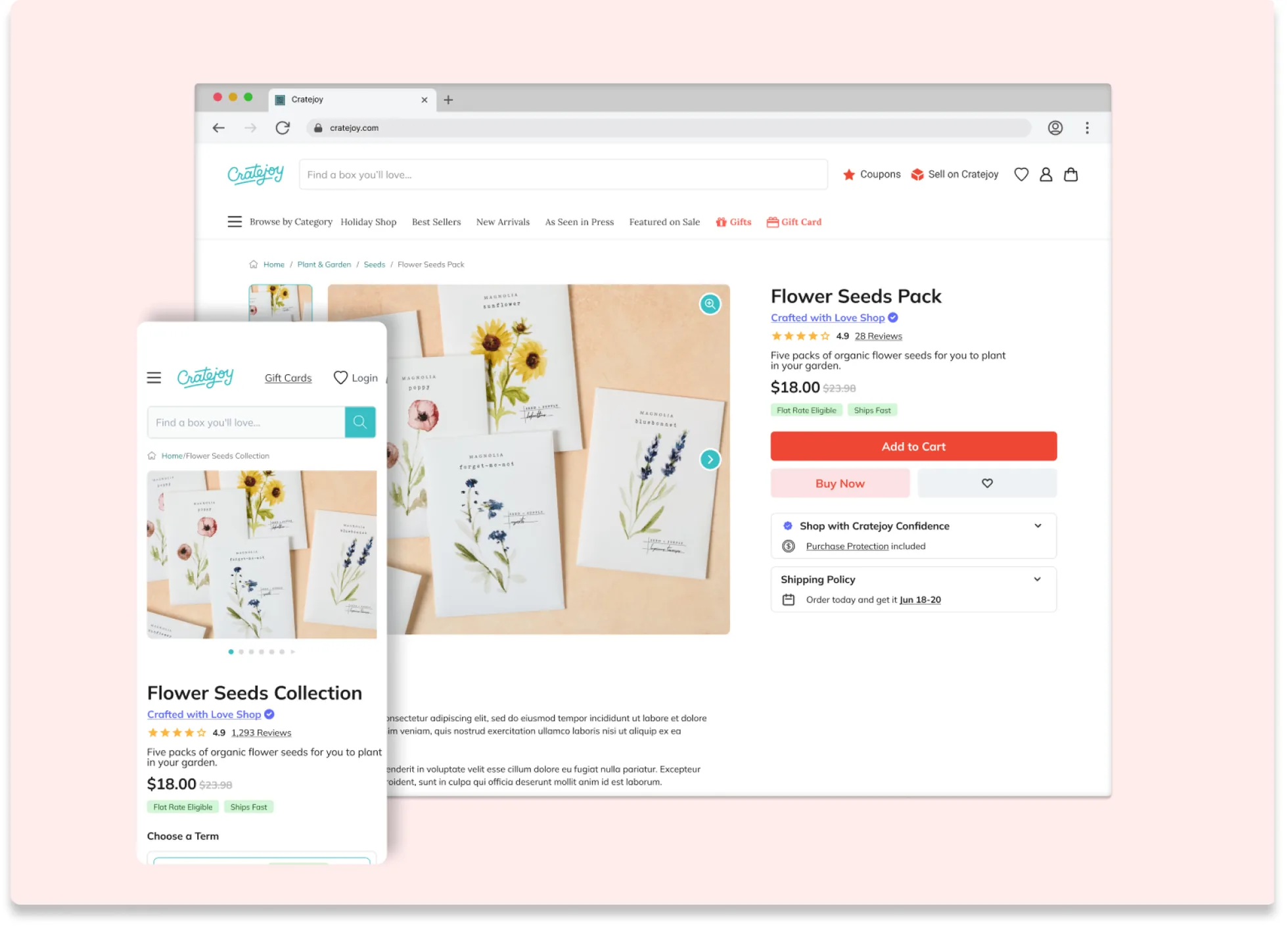
I worked with Cratejoy to create a library of reusable e-commerce components that improved consistency and trust signals across their subscription box marketplace. Working within existing technical constraints at the Brandcave design agency, I componentized and redesigned their product cards, trust indicators, and information architecture patterns over 3 months.
Problem
Design problem
Hundreds of boxes, no consistent way to show them.
Cratejoy’s marketplace had grown to hundreds of subscription box offerings, but its UI components lacked consistency. Product cards displayed information differently across pages, trust signals appeared randomly, and developers were rebuilding similar components over and over instead of using established patterns.
As one of three designers on the project, I was responsible for auditing existing patterns, creating reusable components in Figma, and designing systematic improvements that could be built within the existing codebase.
The constraint: work within the existing component libraries and development timelines, rather than requiring a complete platform rebuild.
Process
Quick wins first
Componentize what exists, then fix what matters most for the least effort.
Starting with HTML-to-Figma captures of the live pages, I properly componentized the existing designs before making improvements. The process prioritized quick wins: changes that were light lifts for both design and development but had high impact.
- Audit existing patterns: I captured and organized the current design system components.
- Competitive research: I studied how successful e-commerce platforms use systematic design patterns to build trust at scale.
- Component prioritization: I identified high-impact, low-effort components that would deliver the most value within existing technical constraints.
- Rapid prototyping: I created high-fidelity designs with quick stakeholder review cycles.
- Iterative refinement: I tested components across different contexts and refined them based on stakeholder feedback.
Solution
Product discovery components
One product card, one clear order of information.
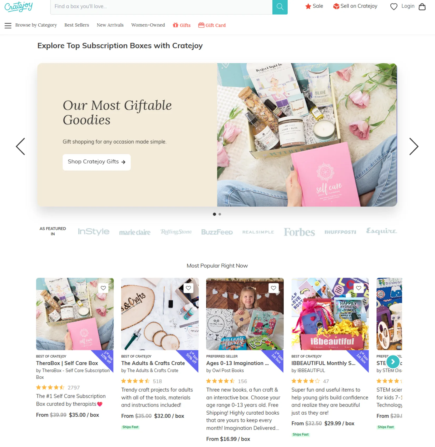
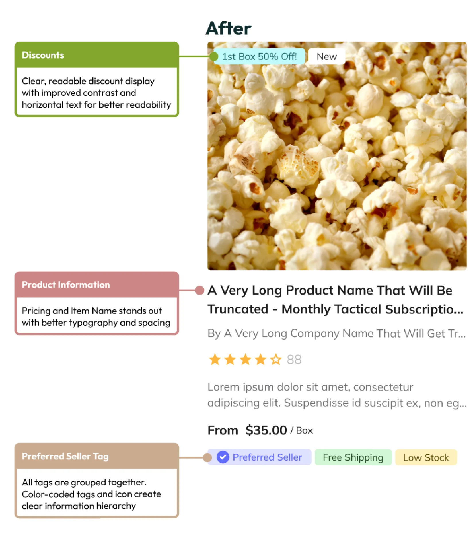
The original product cards had an inconsistent information hierarchy: pricing, ratings, and badges all had the same emphasis and competed for attention. I created a standardized product card component with:
- A consistent visual hierarchy: image → title → rating → price → badges.
- Hover state variants that show alternate product images.
- A reusable badge system (Preferred Seller, Free Shipping, Low Stock, Discounts).
- A flexible layout that adapts to different container widths.
Trust signal components
Reassurance in the same place, every time.
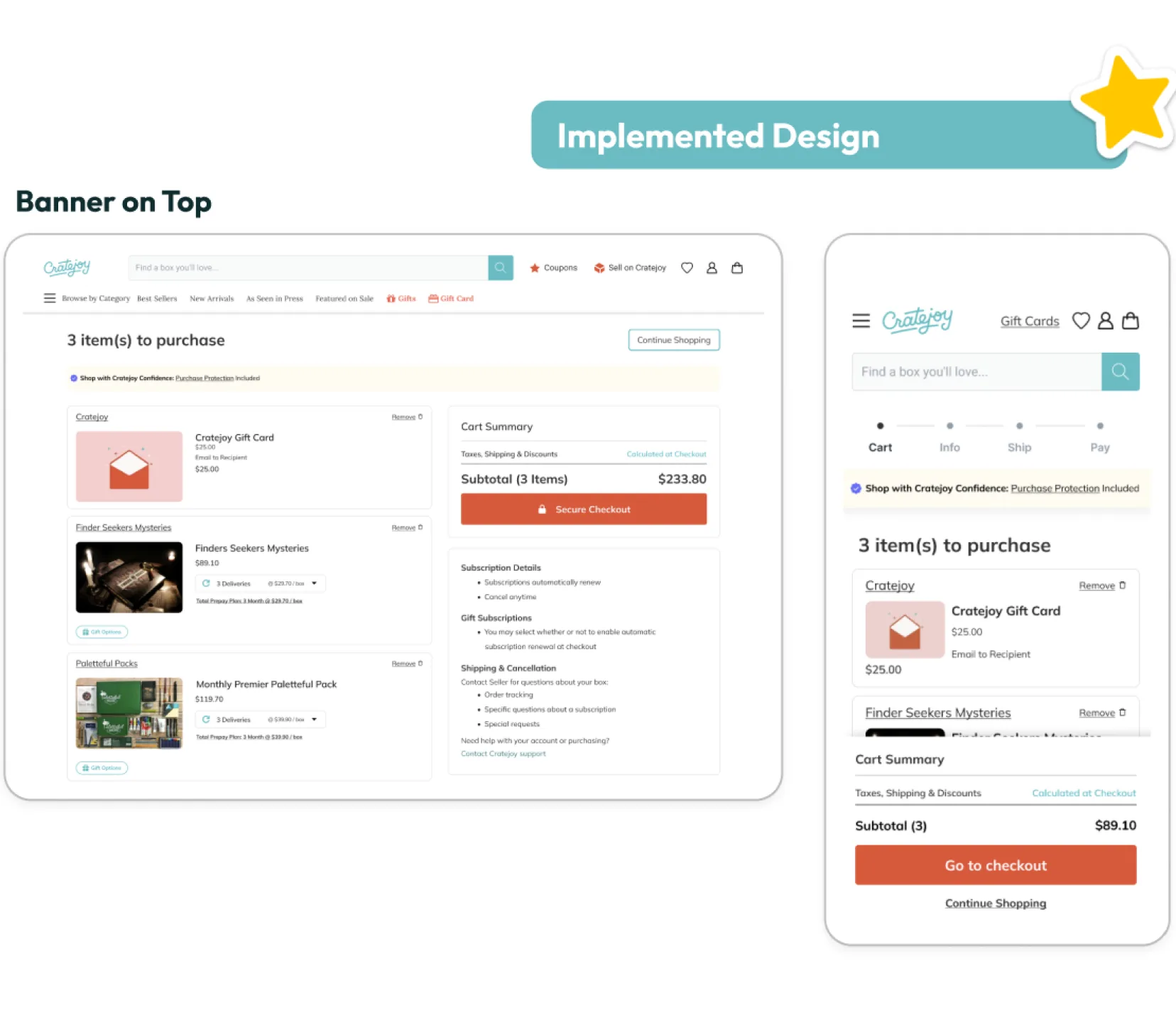
I developed modular trust components that could be reused across touchpoints:
- A purchase protection banner for the cart sidebar and the full cart page.
- Seller credibility badges with consistent styling (ratings, reviews, seller status), also used in the product card.
Information architecture components
Product details you can scroll to, not hunt for behind tabs.
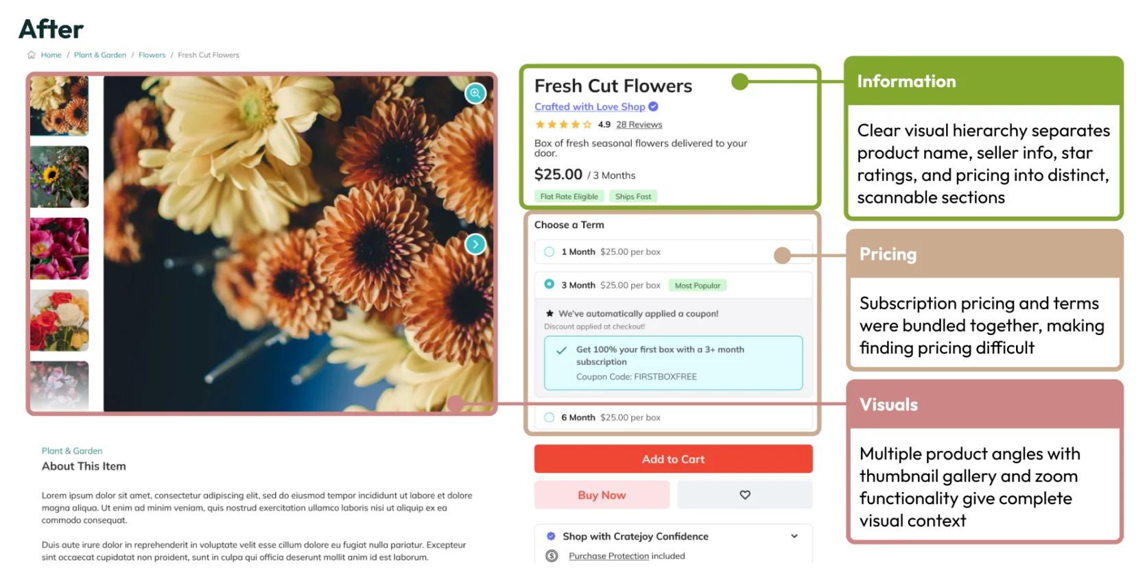
Product detail pages used tabs, which hid information behind clicks. That made discovery difficult and hurt the experience. I created a progressive disclosure component system:
- Scrollable section components with consistent spacing and hierarchy.
- Reusable recommendation modules (Frequently Bought Together, Related Products, and more).
- Flexible content blocks that work across different product types.
- A consistent typography and color system for information hierarchy.
What Launched
What launched
Cratejoy built a hybrid we hadn’t considered, and it worked.
Working at an agency meant fast turnaround. We shared organized Figma files with interactive prototypes showing component behavior, hover states, and responsive patterns, and developers implemented the components straight from the Figma designs.
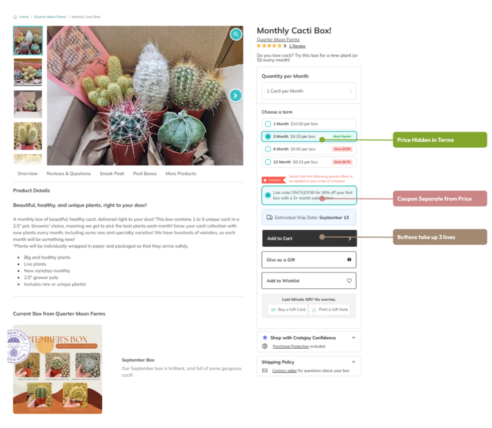
We recommended removing tabs entirely in favor of scrolling, but the company developed an interesting hybrid: it kept the familiar tabs and turned them into sticky navigation that acts as scroll anchors. That keeps users in control of navigation while still allowing the progressive discovery that scrolling provides.
Our approach prioritized discovery through sections like Frequently Bought Together and Related Products. The launched version reflects different strategic priorities, balancing discovery with seller-focused features and personalized recommendations based on browsing history.
Results
Results and what I learned
Constraints often lead to more creative solutions than a blank slate.
This project taught me that working within existing component libraries and technical constraints often leads to more creative solutions than starting from scratch. The hybrid tab and scroll approach, which we hadn’t considered, solved user control problems while keeping the benefits of progressive disclosure. Real-world implementation showed me that the best designs come from collaboration between ideal UX principles and practical business constraints.
Results, for whom
For users
- Predictable product card layouts across all listing pages.
- Consistent trust signals throughout the purchase journey.
- A clear information hierarchy that reduces cognitive load.
For development
- Organized Figma components made implementation more efficient.
- Consistent patterns reduced the need to rebuild similar features.
- Interactive prototypes clarified component behavior.